Waddefok Magazine
Introduction
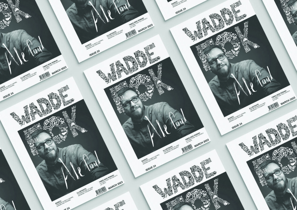
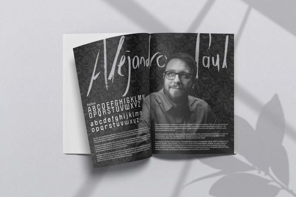
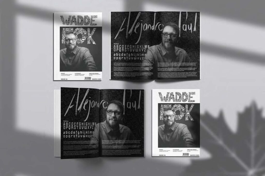
Typography is a growing art in modern times and there are many new upcoming typographers that create their own typefaces. These artists need to be displayed somewhere to get their typefaces out in the world and to inspire new typographers. Therefore, a Cover Page for the WADDEFOK Magazine needs to be created along with a double page spread featuring an upcoming typographer, Alejandro Paul, the creator of the typeface Acumin Variable Pro (one of out favourite typefaces).
Target Audience
There are many typographic artists with new typefaces that are very futuristic and technologically based. The Magazine Cover is target towards people who want to create their own hand rendered typography and design layouts, this target audience is south African based and for designers who are being taught in the technological aspect of design so that they might not forget the importance of traditional media. The Double Page Spread is targeted towards typographic artists in South Africa to gain inspiration from all artists and demonstrate that they can express themselves through typography.
Positioning Statement
For Aspiring Typography Designers, the WADDAFOK Magazine will make it easily accessible for young and new designers to see Upcoming and new typography designers and typefaces. WADDAFOK Magazine will present its work with an aesthetic appeal so that people feel the need to pick up the magazine and it can stand apart from other boring magazines.
Message
An aesthetically pleasing typography magazine that people will want to pick up whether they know what its about or not, as it stands apart from other magazines around it.

Cover Page

Double Page Spread

